A Complete Guide on Choosing the Right Font for Your Brand
When it comes to choosing a font for your brand, there are a lot of factors to consider. What message are you trying to communicate? What feeling do you want your brand to evoke? What is your budget? With so many options out there, it can be difficult to nar
When it comes to choosing a font for your brand, there are a lot of factors to consider. What message are you trying to communicate? What feeling do you want your brand to evoke? What is your budget?
With so many options out there, it can be difficult to narrow it down to the perfect font. But don't worry, we're here to help. In this complete guide, we'll walk you through everything you need to know about choosing the right font for your brand.
1. Know the Font Personalities
As a business and brand owner, we’re sure you’ve already got your brand personality and voice figured out. And that includes the brand messages and images you want to showcase and communicate to your customers as well as employees. All you need to start doing when choosing a brand font is to match your brand to the font that helps speak out your brand personality.
That is why the first step is to research and comprehend each font’s personality in order for you to pick the suitable one. Every font exudes different impressions and messages, hence, picking an inappropriate one can signal confusing messages to your consumers.
In this section, we’re going to highlight the 5 major groups of fonts and their font personality that can be used in branding, web design, packaging design and advertising.
Serif

“Serif” refers to the tiny decorative lines or strokes that are attached at the end of the letters. Serif fonts are perhaps the most classic and traditional type of fonts. They evoke the feeling of formal, traditional, serious, professional and authoritative. Hence, it is largely used by professional businesses like automobiles, law firms, and insurance companies.
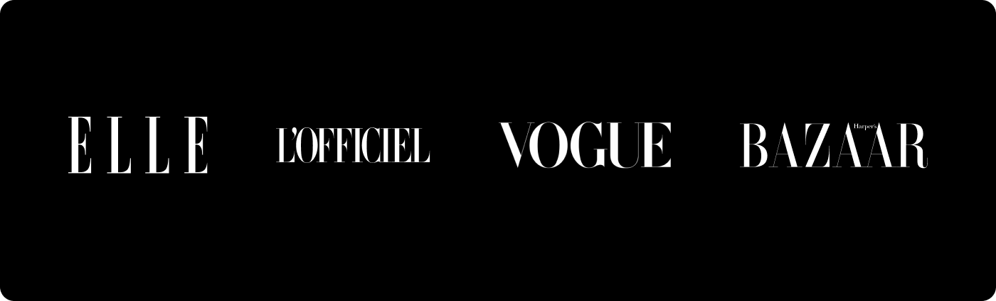
Not only that, but because of the decorative strokes, Serif fonts also communicate elegance, fashionable and confidence. Thus, a few fashion magazines use Serif fonts as their brand fonts such as Elle, L'Officiel, Vogue and Harper’s Bazaar.
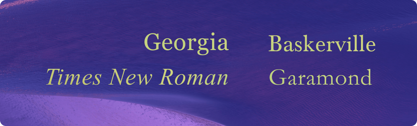
Some of the popular Serif fonts are:
Sans-serif

Different from Serif, Sans-serif fonts don’t have “serif” or tiny lines at the end. Hence, the name, Sans-serif. They look comparatively more modern, simple and informal. Without the “serif”, Sans-serif fonts are leaning on the simplistic and minimalistic approach with their crisp and clean lines. This is also the reason why designers like using Sans-serif fonts on the body paragraph of web content as it is easier to read.
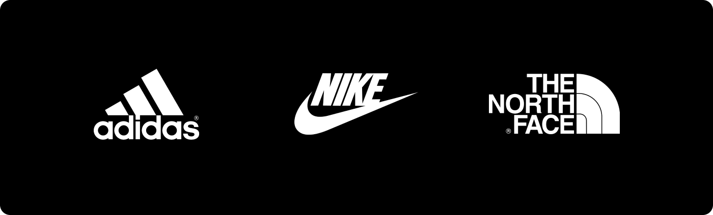
If your brand is young and wants to communicate the feelings of fun, friendly and approachable, Sans-serif is the one for you. It is especially a favourite font to be used by sports brands and tech companies. For instance, Adidas, Nike, The North Face, Under Armour, Facebook and LinkedIn.
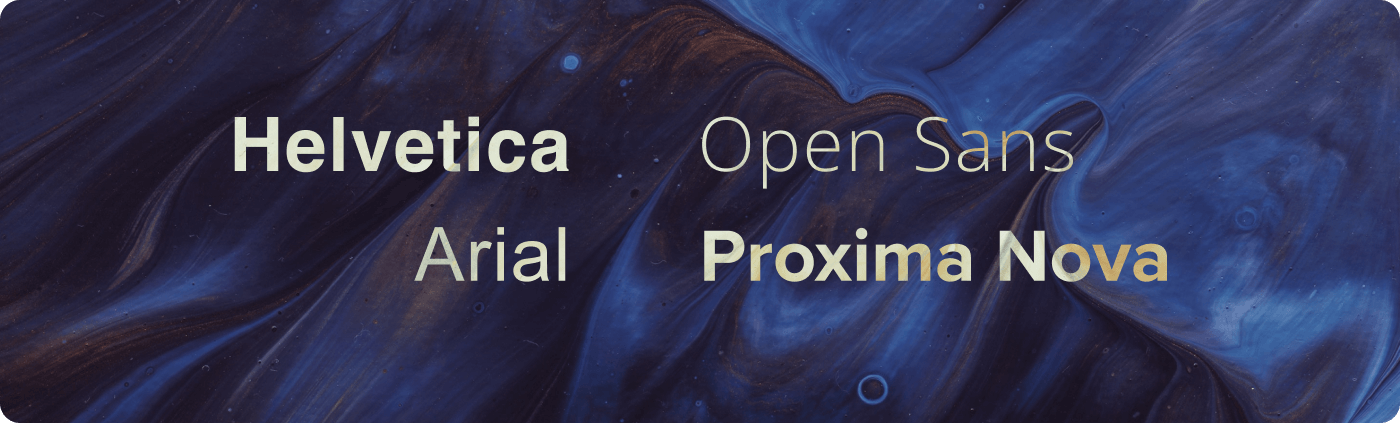
Here are some famous Sans-serif fonts:
Slab Serif

Do you know that Slab Serif is also known as Slabs, Egyptian, or Clarendon, and is also one of the historical classifications of fonts?
Although it is classified in the Serif group, its characteristic is closer to Sans-serif than Serif. With its chunky heavy blocks and thick “serif”, Slab Serif is loud and attention-grabbing in its own peculiar way. It is often used in advertising poster headlines and logo designs because of its outstanding appearance.
By using this kind of bold font, brands could create an impactful impression that shouts out confidence and authority to their consumers. Some of the brands that use Slab Serif fonts in their logo design are Sony, Volvo, and Honda.

Here are some examples of Slab Serif Fonts:

Script

The Script fonts could also be known as Cursive fonts because of their handwritten-like nature. Due to its soft cursive twirls and calligraphy strokes, the Script fonts provoke feelings of femininity, gentleness, elegance, creativity and freedom. If you want to add a personal and human touch to your brand logo, using Script fonts is an ideal way to get closer to your customers. However, this font should be used sparingly as it can be difficult to read at times.
The brands that used Script fonts in their logo commonly present a free and artsy image. For instance, Ray Ban, Vimeo, Sharpie and Instagram.

Some of the famous Script Fonts are:

Decorative

Decorative or Display Font is a creative and eye-catching typefaces. This is the font where you can try out your creativity as it can be designed, edited and tweaked to suit different kinds of brand traits and industries. If you want to showcase your originality, authenticity and specific emotions related to your brand, use decorative fonts. Nonetheless, you have to be careful when pairing the fonts together. If you’re in doubt, it’s best to leave it to professional designers.
2. Decide on Free, Paid or Custom Design Fonts
While many might think that it’s the gospel truth that paid fonts are undeniably better than free fonts, we’d suggest that what’s “better” actually goes beyond monetary value. Each has different advantages and either could end up being the perfect match for your brand, depending on what your specifics are!
The main difference between free fonts and paid / custom fonts is who made them. Paid fonts usually are created by professional type designers who are well-versed in what makes a font good. On the other hand, free fonts could either come from the selection provided by the system (those already available in your device/software) or from open sources (i.e. Google Fonts, DaFont, etc), which are typically created by amateur or hobbyist type designers. While not necessarily a negative factor, it might contribute to the variations in font versatility and quality.
To give you a more complete understanding of this concept, let’s look at several factors that could help you decide on the chosen font!
A. Budget

Let’s tackle the obvious point of consideration first. If your budgeting for font licensing is on the lower end, then we’ve got to set some realistic expectations. No, you probably won’t be able to get the most intricately customized font for your brand, but there are still plenty of free or affordable options out there that might fit the bill! If you’re looking for free fonts, you can check out: DaFont, Font Squirrel, and Google Fonts.
A font license can range anywhere from completely free to several hundreds of dollars, which is why it is crucial to understand your budgeting boundaries and look at typefaces within that scale. Interested in checking out some paid artistic fonts? Check out: Creative Market, MyFonts, and Font Font.
There are a few types of font licenses that you should be aware of - desktop font license, commercial font license, web font license, app and epub font license. They relate to the kind of usage that is permitted by the type foundry, such as the number of desktop users who can install it, the number of web views the web font can serve and the ways the font can be embedded into an app. Hence, to avoid your company getting into hot water with the legal department of the type foundries, be sure to read all the licenses before purchasing and using the fonts.
B. Personality & Impression
Are you a luxury clothing brand that exudes grace and elegance? Or are you a fast-paced, technologically-advanced engineering company with years in the industry? Whatever your brand personality and image is, your font should further reinforce that idea to your clients and customers. Filter through a large selection of fonts and don’t be afraid to experiment between serif and sans serif fonts until you find one that just clicks.
If you find that none of the existing free or paid fonts are satisfactory, then you might have to consider forking out a sum of cash to engage a type designer to create a custom font that will just ooze your brand’s aura. Custom fonts often contain embellishments that take a font from being “not quite there yet” to “just right”.
C. Legibility
In some cases, fonts aren’t necessarily meant to be read. For example, design-centric fonts that are fun and eye-catching might not be the best option for a corporate firm, as relaying information might be difficult due to the details in each letter being too overwhelming or outlandish. However, a design agency might appreciate them as they highlight the nature of the brand as well as their sense of creativity.
Although this is not a feature that is particularly indicated by being in either the free or paid categories, knowing what the font will be used to convey for your brand would be a plus point in helping you narrow down your options. This would tie in with the final factor, which is:
D. Purpose & Usability
When you choose your brand fonts, it’s not necessarily going to be used for your brand logo only. There is a fair chance that you might be using the same fonts for your marketing collaterals like website, brochures, flyers or packaging. Thus, you’ll need to have a rough idea of where the font is going to be applied within your brand’s assets or products.
If you have decided to use one type of font across your brand assets, then you’ll have to make sure that the chosen fonts are flexible and scalable to use in different mediums and sizes. For example, does the selected font go well with the packaging design of your new product or does it make it look messy and disorganized?
Additionally, some fonts are meant for one-time uses only; perhaps for a particular campaign or project as compared to being set as the brand’s main font. With that specific information in mind about your own needs for the font, you would then be able to narrow down the choices.
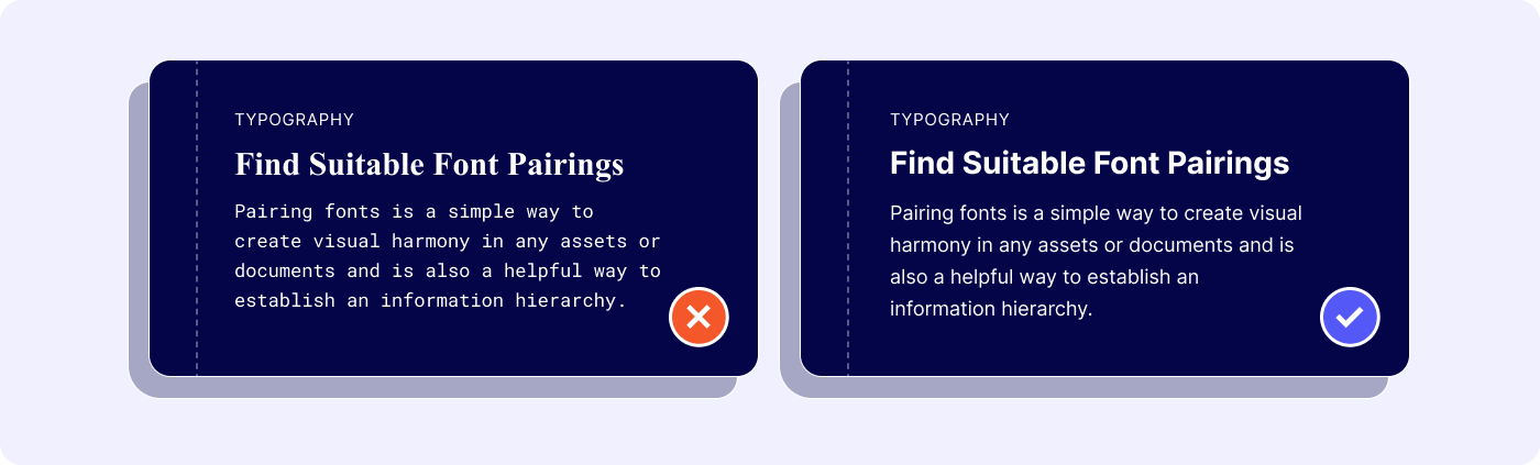
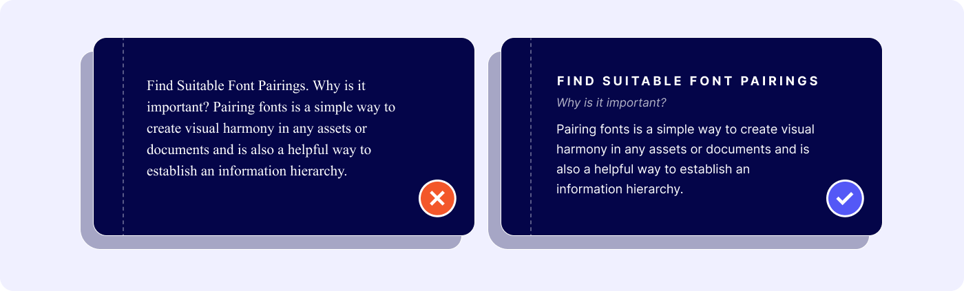
3. Find Suitable Font Pairings
Now that you know how to choose your main brand font, it’s time to start thinking about adding on a complementary font to keep it company. Pairing fonts is a simple way to create visual harmony in any asset or document and is also a helpful way to establish an information hierarchy to help guide readers in the order of what to read first. Here are some of the general do’s and don’ts when pairing fonts!
A. Combination of Serif and Sans-serif Typefaces
When combining both Serif and Sans-serif fonts, the basic rule is to have distinct contrast between the fonts used as it appeals to the eyes of readers. If typefaces are seemingly identical to each other, it simply wouldn’t work well.
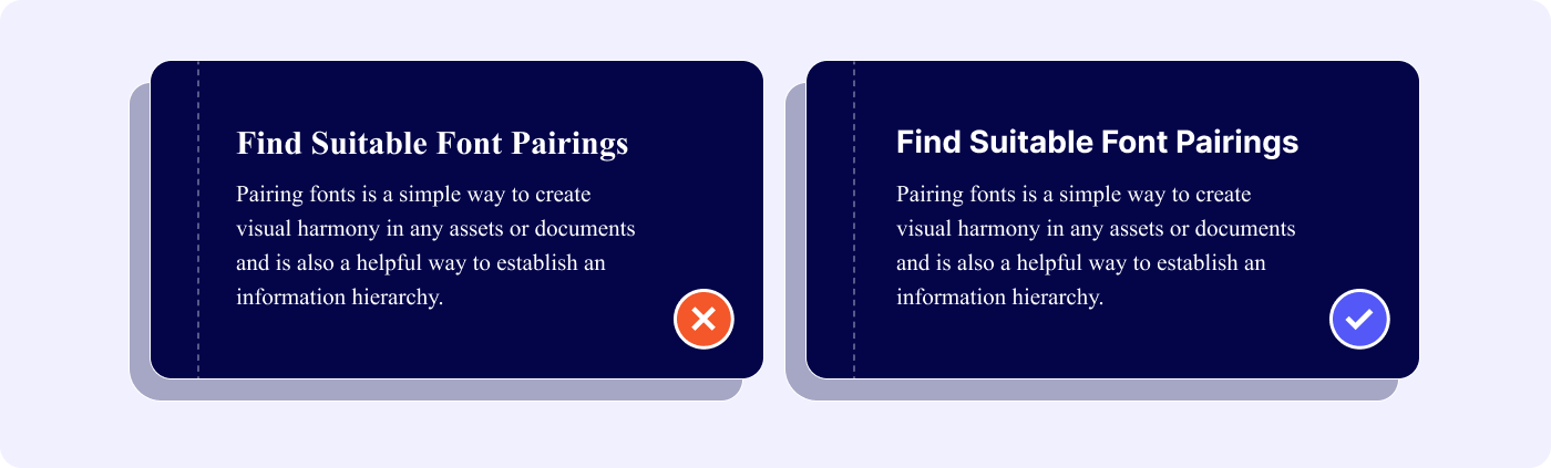
The left one wouldn’t create enough contrast which makes it a little harder to digest for the readers. On the right, there is a clear distinction between Sans-serif font and Serif font that make the combination visually appealing.
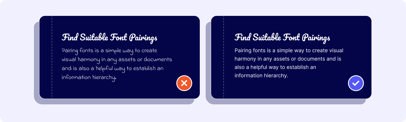
B. Steer Clear of Jarring Pairings!
While having differentiation is important, there is a difference between contrasting and being too jarringly different.
The left one feels messy and discordant, while the right one is harmonious and comfortable to look at. Proportions and x-height should also be taken into consideration when combining fonts. For example, Impact with Montserrat do not go well together as there’s too much contrast between the widths.
C. Combining the Neutral with Distinct Types
When one of the fonts used has a distinct character and outstanding style of its own, it’s best to avoid another font that carries the same weight of attraction. It is better to pair the striking font with another that is plain and basic.
D. One is Fine too!
Let’s keep it even simpler! A classic typeface has many different fonts that one can explore and you can avoid the mental gymnastics of having to find the right typeface pairing.
E. Assigning Roles to Fonts
Having one font for titles and another for body copies and a third for bylines or subheaders throughout an article or document enables it to look clean, precise and professional. It’s a good way to display the difference between title and body copy clearly and harmoniously. It is especially crucial to be specific about when and how your fonts are used when you add more of them to your articles or documents.
These work as specific distinctions to guide readers to best understand the focus of the article or document.
Experiment with it yourself! It’s not dead-set. Put yourself in the shoes of a reader and pair the different fonts together or shift them around to see which is better.
There you have it! An in-depth guide on ways to choose the right font for your brand. As important as brand colours, fonts also help build up your ideal brand image and convey messages to your consumers. This is the reason why it is important to have a Brand Guideline to tie everything coherently together and get all your employees on the same page when it comes to branding. Getting in touch with a branding agency is always a safe way to kickstart your branding!