Everything You Need To Know About Brand Colour Palette
What is your first thought when Starbucks is mentioned? Is it its green Siren logo? What about Domino’s Pizza? Is it red and blue? Have you ever wondered how when you recall a brand, you remember its colour first? How do some brands have a visually pleasing
What is your first thought when Starbucks is mentioned? Is it its green Siren logo? What about Domino’s Pizza? Is it red and blue?
Have you ever wondered how when you recall a brand, you remember its colour first? How do some brands have a visually pleasing and coherent colour palette that just portrays their brand personality nicely?
This is because these brands have combined both the science behind colours and branding expertise into creating a perfect Brand Colour Palette.
What is Brand Colour Palette?
Brand Colour Palette is a collection of colours that are put together to illustrate your brand personality visually. It is often used in your logo, website, social media, packaging and various other branding and marketing collateral. In other words, your Brand Colour Palette is as important as your logo. It is the face of your brand that helps create a vibrant and interesting visual experience for your target audience. Not only that but your Brand Colour Palette also helps showcase your unique personalities and goes through thick and thin with you in every branding and marketing campaign.
You see, according to studies, colour is able to elevate brand recognition and recall by up to 80%. That’s why we commonly associate brands with their colours, think of McDonald’s red, Facebook’s blue and Cadbury’s purple. Moreover, a whopping 84.7% of consumers believe that colours account for more than half of the factors when purchasing. This tells us that the influence of brand colour extends beyond the logo, where your packaging and website colour should be coherent too.
So, the question is not why is Brand Colour Palette important. Instead, it’s about How to create a perfect Brand Colour Palette that increases brand awareness and fosters brand loyalty.
How to Pick the Perfect Colour Palette for Your Brand?
1. Identify Your Personality
The world has more than a billion shades of colours. How are you going to find a perfect and suitable one for your brand?
Well, first things first, you’ll need to identify and determine your brand identity and personality. You can try to communicate your brand personality through words first before translating them into colours. This means laying some groundwork like brainstorming adjectives that describe your brand.
Here are some ways to analyze your brand personality:
- Ask your loyal customers what best describes your brand
- Have your employees come up with a list of brand identities
- Research on competitors and find out what makes you stand out
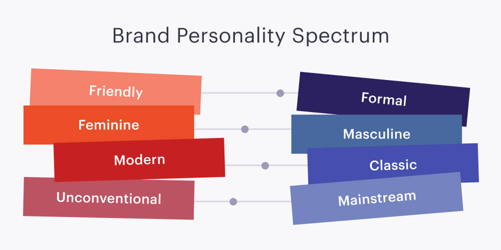
If you still find it tough to discover your brand personality, you could try using the Brand Personality Spectrum to assist you.
2. Choose a Core Colour According to Your Brand Personality
After you have all the important traits that best describe your brand, it is now the time to translate them into colours. To do this, you will need to do thorough research on the meanings and psychology behind the colours. This would include the colour associations and the emotions colours evoke.
Here is brief information on some of the common connotations of the colours:
i) Red is often associated with passion, excitement, energy and danger. In marketing and advertising, this colour is often used to grab attention because it is loud and daring. Hence, it is commonly used on action buttons such as “buy now” or “order now”. Likewise, red is also an appetizing colour that is widely used in the food industry. For example, KFC, McDonald's, and Pizza Hut.
ii) Orange stands for fun, cheekiness and friendliness. Take Nickelodeon, for example, it has a playful personality with orange as its brand colour and a dynamic logo that could easily transform into different shapes.
iii) Yellow signifies happiness, positivity and optimism. Digi is an example of a yellow brand colour that portrays optimism.
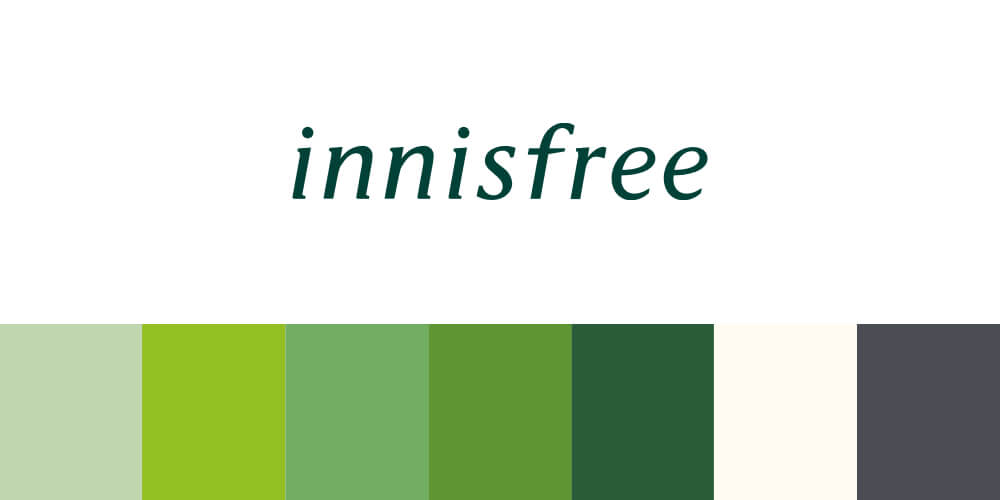
iv) Green is strongly associated with nature, earth, growth and wealth. Therefore, it is normally used on brands that promote healthy living, sustainability and are environmentally friendly. The South Korean skincare brand, Innisfree uses green as their brand colour to reinforce their natural ingredients from Jeju island.
v) Blue evokes the feeling of trustworthiness, professionalism and tranquillity. That’s why banks like Citibank and RHB Bank use blue as their brand colour.
Nonetheless, the colour meanings are very subjective to the culture, context and personal experience of your target audience. You should execute detailed market research before deciding on the final colour. Take the list above with a grain of salt and focus on what kind of emotion and mood you want your brand to evoke and relate to.
3. Utilize the Formulas to Build a Colour Scheme for Your Brand
Once you’ve picked a core colour for your brand, you can then proceed to build a colour scheme surrounding your brand. To give you a head start, here are 5 formulas of colour combinations for you to create the perfect logo colour combination.
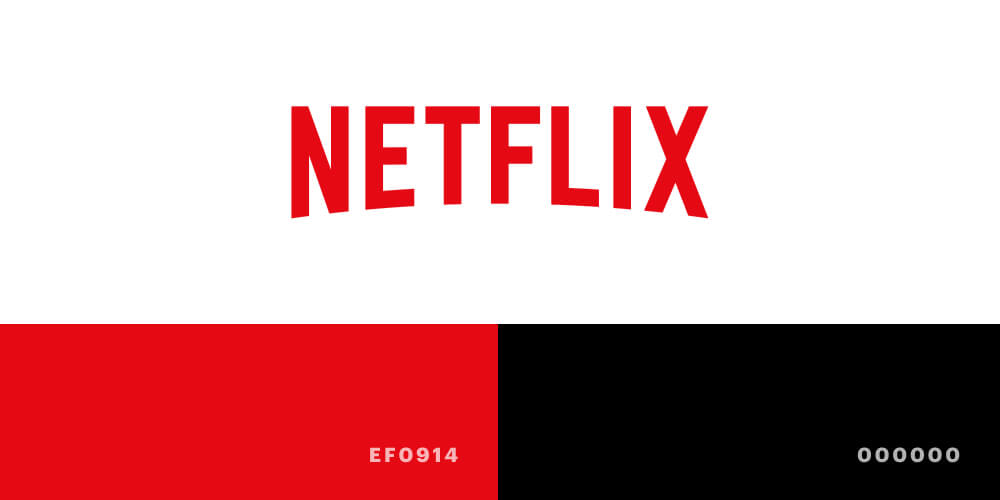
i. 1 Core Colour + Neutral Shades
For most tech companies, 1 core colour with some neutral shades is already more than enough to convey their brand personality and uniqueness to their customers. It is simple, striking and easy to recognise.
For example, Netflix, Spotify and Zoom use the core colour of red, green and blue respectively.


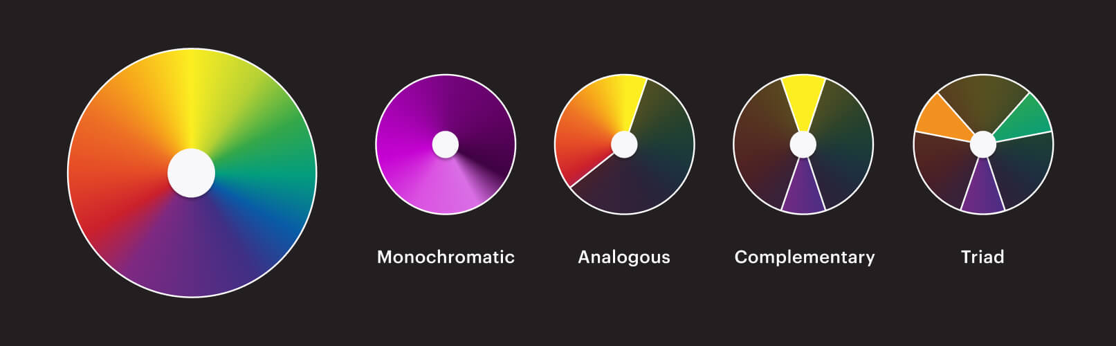
ii. Monochromatic Colours
This formula focuses on highlighting one personality trait of your brand and presenting it in a coordinated whole. In other words, monochromatic can be defined as creating a colour palette using the same colour in various shades.
As an example, Facebook and Innisfree use a monochromatic colour palette for their branding.

iii. Analogous Colours
If one colour is too dull but you don’t want to go overboard colourful either, analogous colour schemes could be your thing! By combining the colours that are close to each other on the colour wheel, you could create a harmonious, visually pleasing and balanced colour palette.
iv. Complementary Colours
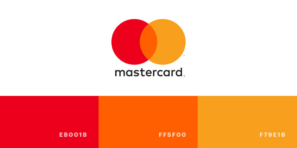
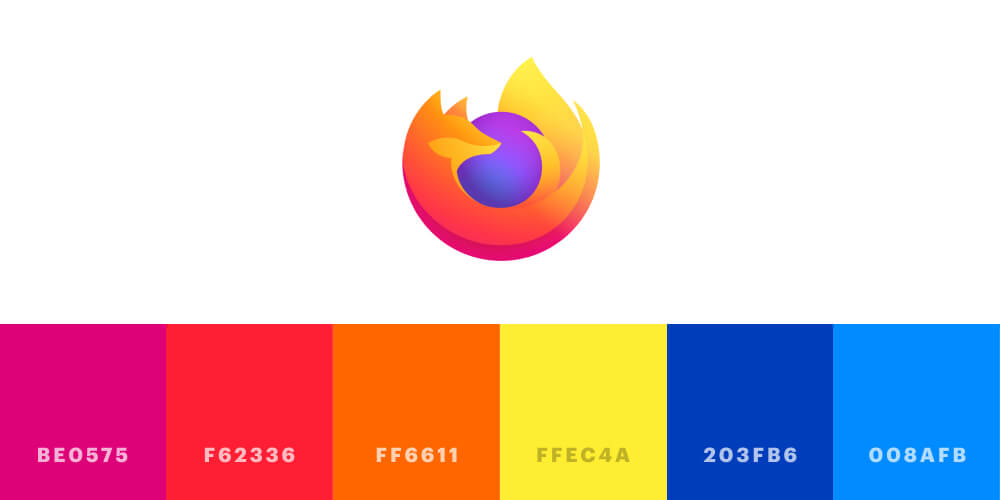
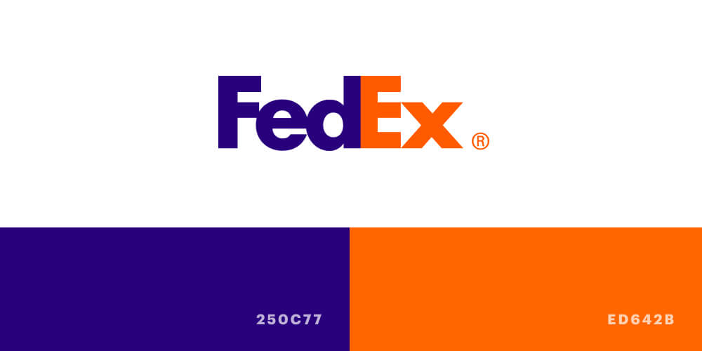
To spice things up, a complementary colour scheme could help attract attention to your brand. These colours are located directly opposite each other on the colour wheel as they have high contrast. Therefore, when they are put together, they could create eye-catching sparks for a dramatic and interesting look. When designed right, the complementary colours will be able to help illustrate the different ideas and values behind your brand and visually stimulate your customers.
Firefox and FedEx are two wonderful examples of brands with complementary colours that just work well together.
v. Triadic Colours
While the Bermuda Triangle makes you disappear, a triangle on the colour wheel makes you pop and stand out from the crowd. Similar to complementary colours, triadic colours also play with contrasting colours. But instead of direct opposites, triadic colours pick three sections from the colour wheel. With triadic colours, you get to play around with different colours and their meanings. However, the difficult part is finding suitable shades that could complement each other.
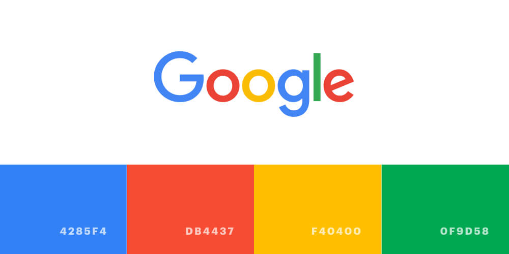
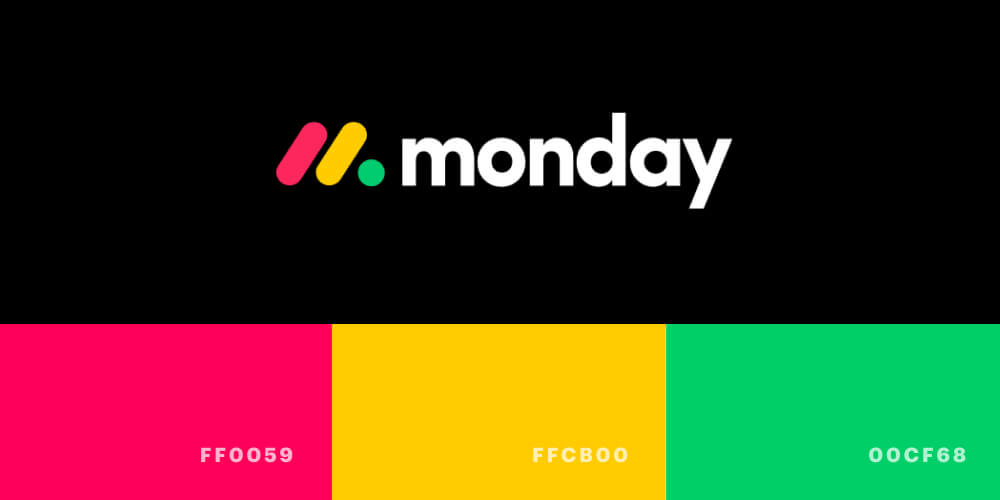
The two famous brands with the triadic colour palette are Google and Monday.com. The vibrant colours make them seem fun, friendly and approachable.
Basic Colour Knowledge
So, you’ve gone through all the steps and finally picked your brand colours. What’s next? How are you going to centralize and apply them to your branding and marketing collateral?
To start off, we’ll run through some basic colour terms, models and rules for your easy understanding.
- Colour terms
- Hue: Refers to the dominant colour we see. Eg: red, blue, green
- Tint: Refers to any pure colours with only white added. Also, knowns as pastel
- Tone: Refers to any pure colour with only grey added
- Shade: Refers to any pure colour with only black added
- Saturation: Refers to the intensity of the colour
- Value: Refers to the measurement of the colour brightness
- Colour Models
i) RGB - red, green, blue; commonly used when working on digital-based designs such as a computer or phone screens
ii) CMYK - cyan, magenta, yellow, black; commonly used on traditional printing
iii) HSL/HSV - hue, saturation, lightness/value; similar to RGB but expressed differently in terms of numerals
iv) Pantone - first colour matching system & considered the most accurate; comprises 1876 solid colours; used for both digital and print media
- The 60-30-10 rule
Although this golden rule is known for interior design, it can be employed in graphic design and UI design too. The 60-30-10 rule refers to an ideal proportion to apply your brand colours to branding and marketing collateral such as website, infographic and newsletter design.
- 10%: your brand core colour
- 30%: your brand secondary colour
- 60%: neutral colour
This way, your design will have a balance in terms of colour and won’t be overstimulating for the eyes.
Last but not least, it’s time to show your true colours! Brand Colour Palette is an essential tool that helps your brand to stand out by showing your characteristics, personality and depth. Nonetheless, having a Brand Guideline is inevitable to unify your brand elements and tie all your brand colours together beautifully. Get in contact with a branding agency to get started on your branding and Brand Colour Palette.